Shopify Mobile Filters: Nine Failure Modes I Keep Finding
Shopify mobile filters fail silently on real phones in nine specific ways. Here is how I tell them apart, and the one-line CSS fix for each.
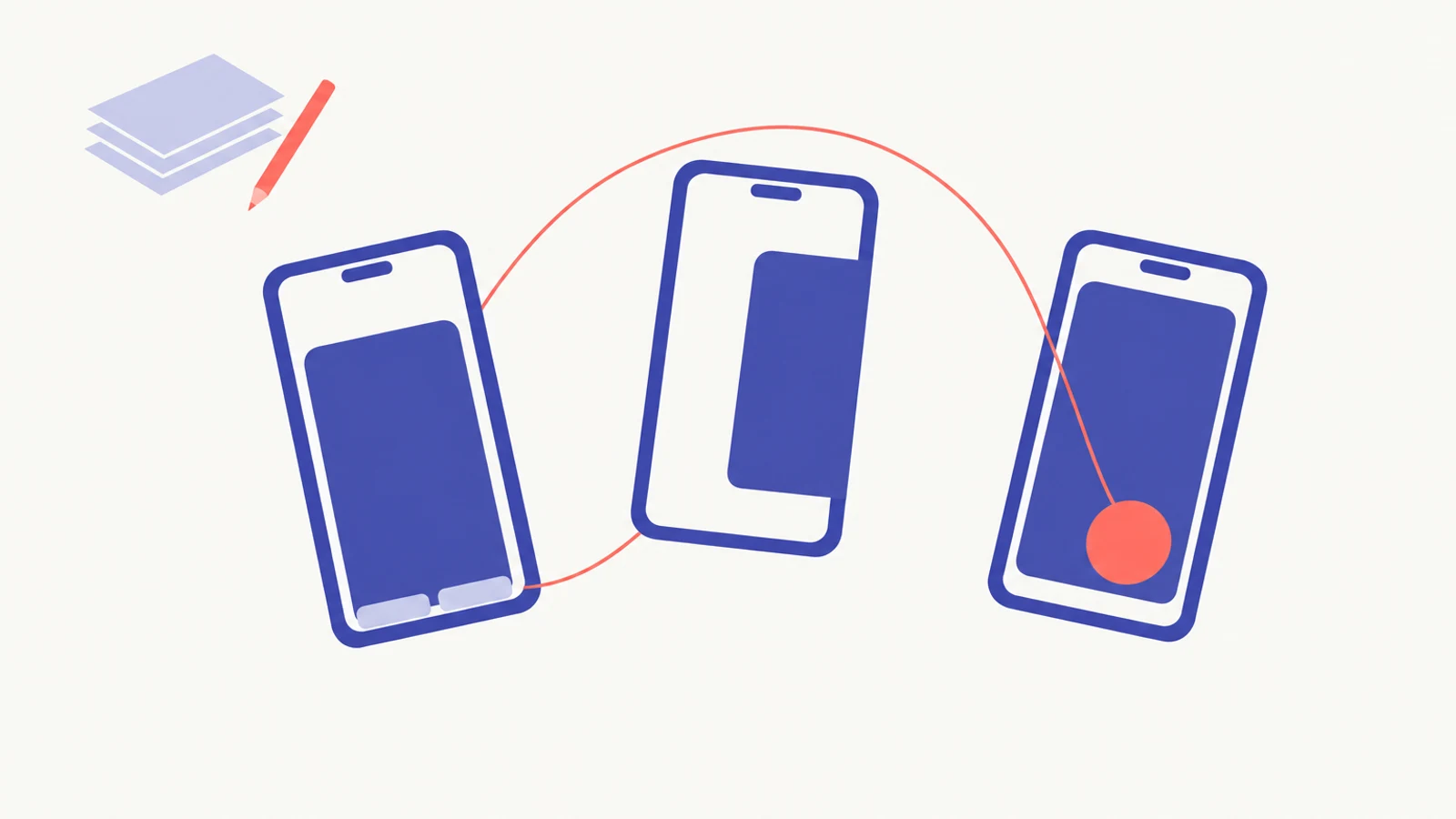
About twenty Shopify Community threads and Dawn GitHub issues on one open tab. That is where I was this week, trying to map the same complaint merchants keep writing in - "my filters don't work on my phone" - to the specific root cause in each store. I expected two or three overlapping bugs. I ended up with nine distinct shapes of silent failure, six of them pure CSS, one a hard platform cap, one an accessibility regression, and one an interaction between a widget nobody installed on purpose and a theme file nobody edits.
If you have to triage one of these for a merchant today, this post lays out what I check and in what order. Shopify mobile filters are one of the places on a Shopify storefront where "works for me on desktop" is a lie almost by definition, and the shape of the lie matters.
What I check before I touch any CSS
Open the collection page in Chrome on your actual phone. Not in the Shopify theme editor's mobile preview. Not in Chrome DevTools' device emulation on your laptop. A real iPhone or a real Android handset, in your hand. The theme editor runs inside a desktop browser; it cannot simulate iOS Safari tap handling, the browser chrome that eats part of the viewport on real phones, or the way position: fixed reanchors when a page overflows horizontally on Android. It will tell you filters work. Your customers will tell you they do not.
Then step through this, in order:
- Is the filter toggle button visible before you tap?
- Does tapping it open a drawer?
- Are the Apply and Clear buttons visible at the bottom of that drawer without scrolling past the end of the page?
- Does tapping Apply actually close the drawer and update the grid?
- Does tapping a text label on a checkbox filter activate the filter, or do you have to tap the little box itself?
- On Android, does the drawer render on your screen at all, or does it slide off to the right?
- Is there a chat or review widget covering any part of the drawer?
Each "no" lands you on a different failure mode. I did these in a different order for about a year and kept missing the Apply-button-below-the-fold case because I would tap Apply, something would happen, and I would move on. The thing that happened was not always what I thought.
The six Shopify mobile filters failures that one CSS rule fixes
Six of the nine resolve with a single line of Custom CSS, no theme file editing, no app changes. I keep them as a saved snippet. If you are on help1 chat with me and we hit one of these, you will see me paste the matching rule into your theme in about thirty seconds.
1. The invisible filter toggle (Dawn v11 and v15.1.0). The .mobile-facets__open button inherits a color that matches its background. The button is still in the DOM; customers are tapping a blank space because they cannot see where the tap target is. Fix: .mobile-facets__open { color: #333333; } in Custom CSS, using an explicit hex value. This bug was first reported against Dawn v11 in November 2023, got patched, then came back in v15.1.0 in October 2024 with the inherit workaround turning the text light green. Shopify shipped the bug twice; theme release testing is not catching it.
2. The Horizon z-index trap. On Horizon collection pages, the title block absorbs taps that should be hitting the filter toggle and grid toggle. "Only a tiny invisible area accepts clicks, making them unusable," a community helper named Maximus3 wrote in June. Fix: .facets-toggle { z-index: 100; } in Custom CSS. One rule, confirmed working, no Liquid edit. If you are on Horizon and a merchant says buttons "almost work" on mobile, this is the first thing I check.
3. The Apply button that is literally below your phone. Dawn 15.0.0 set the filter drawer height to 100vh. On real iPhones and Android handsets, 100vh includes browser chrome - the address bar, the nav bar - so the drawer extends past what you can actually see. Apply and Clear are rendered somewhere below the fold with no scroll path to reach them. Filed as Dawn issue #3970 in August and auto-closed as "stale" on November 4 without a named fix. The current Dawn main branch uses a four-sided position: fixed anchor instead, which sidesteps the problem by pinning Apply to the bottom of the viewport. If you are on 15.0.0 and have not updated, you can patch it locally by replacing 100vh with 100dvh in the filter drawer container. Otherwise, update Dawn.
4. The iOS Safari checkbox label gap (pre-Dawn 15.3.0). On iOS, tapping a checkbox's text label does not activate the underlying input when the input is tiny and hidden under the label. Only tapping the little box itself does. Image swatches and colour swatches work; text-labelled filters do not. Fix: .swatch-input-wrapper [type=checkbox] { width: 100%; height: 100%; } in Custom CSS. Dawn 15.3.0 ships this change by default; stores on older Dawn versions still have the gap. If a merchant says "filters work but only when I tap the swatch image", this is it.
5. The Shopify Chat widget on top of Apply (any theme). Shopify Chat injects itself at z-index: 2147483647 - the maximum integer value, ensuring nothing a theme sets can sit above it. Dawn issue #1657, which documents this, was filed in May 2022 and closed "not planned" in July 2025, because the z-index belongs to Chat and not to Dawn. The community-confirmed workaround lowers Chat's z-index instead: #dummy-chat-button-iframe { z-index: 2 !important; }. Same pattern applies to Google Reviews widgets and Shopify Inbox embeds. If the Apply button is visible but tapping it opens the chat window, this is almost always what you are looking at.
6. Desktop and mobile filter layouts both rendering on mobile. On some theme customizations, the horizontal desktop filter row shows up alongside the mobile drawer. Both appear at the same time, and the mobile one is often below the fold. Fix in Custom CSS: hide the desktop facets form under the breakpoint (749px on Dawn). The selector varies by theme; inspect the page to find what is holding the desktop layout in place. This happens when a theme developer patches in a horizontal filter without checking the responsive breakpoint it should disappear under.
That is six. If you can match the symptom on your store to one of the six above, you can fix it this afternoon without talking to anyone. If you are stuck between two of them and want a second pair of eyes before you push Custom CSS to your live theme, the first 15 minutes of expert chat with help1 is free and that is usually enough for this specific shape of problem.
The three that need more than a one-liner
The other three failure modes in shopify mobile filters are the ones where "add a CSS rule" is not enough. Two need either a template edit or a bigger structural decision; one is a platform cap you cannot route around at all.
7. The 5,000-product cliff. Shopify's Search and Discovery engine disables native filters entirely when a collection contains more than 5,000 products. The filter toggle just disappears from the collection page, and the admin surface never tells merchants why. A merchant on r/shopify in October had been uploading trading cards in batches of a thousand on a Basic plan; at roughly five thousand products the filters went silent. The Shopify chatbot said it would resolve in a few hours. It did not. The cap has moved before and Shopify does not announce changes. I wrote about this specific failure mode in a broader audit of why Shopify collection filters vanish last spring; the escape route is the same here: split the collection into sub-collections under the cap, or install a third-party filter app (Boost Commerce, Klevu, Searchanise) that does its own indexing.
8. The Android off-screen drawer. On Chrome and Firefox for Android, a position: fixed filter drawer can anchor against the document width instead of the viewport width if any element on the page is pushing the document wider than the viewport. The drawer renders at full document width and slides off to the right. Vlad92, a merchant on the Craft theme, lived with this for nearly three months before another community member walked him through the diagnostic. The fix was somewhere else entirely. Vlad92 had a Custom CSS rule to fit his announcement bar copy onto one line, and that rule let the announcement bar overflow horizontally by a few pixels. Those few pixels inflated the document width enough to break the drawer anchor. The diagnostic is one line in the browser console: document.body.scrollWidth > window.innerWidth. If that returns true, something on the page is wider than the viewport, and that something is almost always the fix target. Short-term, html, body { overflow-x: hidden; } in Custom CSS buys you time while you hunt the overflowing element.
9. The colour filter that reads a database ID to screen readers. An accessibility researcher tested the demo stores of 49 Shopify themes in October and found that Dawn's colour swatch filter hides the visible label from assistive technology. VoiceOver on iPhone and TalkBack on Android announce the checkbox with an internal Shopify metaobject ID - something like a numeric or UUID string - instead of the colour name. Sighted customers see "Red". Screen reader customers hear a machine identifier. Dawn 15.5.0 shipped an ARIA fix for filtering components in June that addresses part of the surrounding markup, but I have not seen it fix this specific announcement, because the problem is in how the swatch value gets bound to the checkbox input. The workaround is a template edit: add aria-label="{{ value.label }}" to the swatch input in facets.liquid. Keep a backup of the change outside the theme, because an upstream Dawn update that regenerates facets.liquid will quietly overwrite it. European Accessibility Act enforcement has been ramping over 2025 and 2026; if you sell into the EU and your colour filters are broken for screen readers, your exposure is not only conversion.
That is the full nine. Three apps I like for sidestepping the 5,000-product cliff: Boost Commerce, Klevu, Searchanise. None of them are cheap. All three have their own smaller limits. If a merchant is anywhere close to 5,000 products in a collection, I would rather have them pick a filter app now than at 11pm on Black Friday.
What I would audit on your phone before Black Friday
Black Friday is November 27 this year. If you have not loaded your top three collection pages on a real iPhone and a real Android handset this week, that is the first thing to do before anything else on your BFCM list. The audit itself takes fifteen or twenty minutes if you do it in one sitting.
Here is the order I would run:
- Open a product-heavy collection on an iPhone with Safari. Tap the filter toggle. Can you see it before you tap? Can you see Apply at the bottom of the drawer without scrolling past the page? Tap a text label; does it activate the filter?
- Same collection on an Android phone with Chrome. Does the drawer open on your screen, or does it slide off to the right? If the drawer is off-screen, run
document.body.scrollWidth > window.innerWidthin the browser console and find the overflowing element. - Open the Shopify Chat tab if you have Chat enabled, then open the filter drawer over it. Can you still reach Apply, or does tapping it open the chat window?
- If you use metaobject-backed colour filters, enable VoiceOver on iPhone and focus a colour swatch. Do you hear a colour name or a string of digits?
- If any collection has more than about 4,500 products, start planning the split. Four thousand five hundred is a long way below the cap, but the cap has moved before. Do not sit on the edge during a sale weekend.
Most of the merchants who message me the week after Black Friday have the same shape of story. Mobile conversion was flat all weekend. The site stayed up. Nothing errored. When I open their collection page on my own iPhone the Apply button is three pixels below the fold. Shopify mobile filters are one of the places where mobile conversion quietly bleeds for weeks before anyone looks.
If you want help running this audit on your own stack, help1's diagnostic app flags the known mobile filter patterns automatically on a sample of your collection pages, and the first 15 minutes of expert chat afterward is free if you want a human to interpret the output with you.
Where the pattern leads
Nine shapes, one complaint. What I find hardest to accept about shopify mobile filters is that everything on a Shopify storefront breaks on real phones in ways it does not break in simulation, and none of these nine shapes make any noise when they do.
Still stuck? Talk to an expert.
Our vetted Shopify experts can fix this issue for you in a live session. $39 per session. Your first 15 minutes are free.